One of my repeat clients just got their web site pushed live. Head over to www.ramrodstx.com and check them out.
I did the graphics, and Billy at Ramrods built the site himself.
They are a full-service hot rod, custom car, and restoration shop located in Terrell, TX.
These guys are an absolute pleasure to work with. If you need some custom work done, be sure to give them a call!
Wednesday, December 9, 2009
Monday, December 7, 2009
Dallas H.O.G. T-Shirt
From alligators on lawnmowers to swine on motorcycles! Well, the image of a hog on a hog isn't really that novel, but it's one of those things that can be interpreted in so many ways that it will continue to be drawn for years to come.
One of the sales managers at my day gig, Kerry Turner, a very avid motorcycle dude, approached me to create some art for the Dallas Harley Owners Group. I was given a lot of freedom to create a wild hog character on a motorcycle. The character was sourced from photos of actual wild boars.
I don't normally have the opportunity to work with more than one or two colors on a shirt design, but this time I got to go with 6 colors. That added a lot of dimension to the hog character, and really made the art "pop".
The basic production of this piece started with some rough sketches in my sketchbook, then a freehand sketch done digitally in Photoshop.
The Photoshop sketch was placed into Illustrator CS4, and I went to building the vector shapes and colors. This particular piece was done primarily with Illustrator's Blob Brush tool.
This morning Kerry brought me the shirt sample and I'm really pleased with the print quality.
One of the sales managers at my day gig, Kerry Turner, a very avid motorcycle dude, approached me to create some art for the Dallas Harley Owners Group. I was given a lot of freedom to create a wild hog character on a motorcycle. The character was sourced from photos of actual wild boars.
I don't normally have the opportunity to work with more than one or two colors on a shirt design, but this time I got to go with 6 colors. That added a lot of dimension to the hog character, and really made the art "pop".
The basic production of this piece started with some rough sketches in my sketchbook, then a freehand sketch done digitally in Photoshop.
(The HOG logo was obviously copy/pasted, but the rest is all freehand with Photoshop's Brush tool.)
The Photoshop sketch was placed into Illustrator CS4, and I went to building the vector shapes and colors. This particular piece was done primarily with Illustrator's Blob Brush tool.
(Final Art)
This morning Kerry brought me the shirt sample and I'm really pleased with the print quality.
(Actual Shirt- Back)
(Actual Shirt- Front)
Monday, November 30, 2009
Gator Power Illustrative Logo
I've mentioned my friend Chandler before, and he recently hooked me up with some work for one of the suppliers he deals with at his day gig. IrriGators Supply out of McKinney, TX has seen a need in the commercial landscaping power equipment market, so they have created Gator Power Equipment as a division of their company.
They had already had some branding using an Alligator mascot for the older company. The previous artist has since passed away, so they needed to find someone who could keep the spirit of the former branding.
Previously, the Alligator was posed in a way that he made the "G" in "IrriGators", and this is part of the branding system they wanted to keep with the Gator Power visuals.
I did a few quickie pencil sketches and scanned them and emailed them to the client. They approved the basic concept pretty much immediately, but needed a few changes.
The main thing was that they needed the alligator to be riding on a commercial zero-turn mower rather than a traditional homeowner-style riding mower.
The previous branding used a lot of the Fajita Mild font... and if you know me well, you know I have some misgivings about using this font in places where it will ever appear less than about an inch tall. My main beef is the legibility is very poor when seen small or from far away. This mascot/logo image would be placed on everything from business cards to t-shirts to the 16-feet-long by 8-feet-high side panels of an enclosed trailer. Scalability and legibility are as important as ever here!
So naturally, I had to make some other suggestions, but my contact Scott suggested a second font that showed up in a lot of the old branding. Mistral is another font that I've always avoided for legibility issues. (It was also very cliché in the late 1980s -- I have referred to it as, "The Comic Sans of the late 1980s".) However, I found it stayed pretty legible in all-caps -- something highly unusual for a script font.
(As a side note, I would have preferred to do a hand-lettered version here, but timeframe and budget did not allow for that.)
So once we had the basics worked out, it was time to clean it up with vector work and color. Also, I needed to set up a more horizontal layout for certain instances. Most of the alligator and mower were built using Illustrator CS4's new Blob Brush and Eraser tools controlled by my almost-9-years-old Wacom Intuos 9x12 tablet.
It has been a real pleasure to work with Scott and IrriGators Supply/Gator Power, and it's looking like we'll be having some more visuals coming in the near future. Stay tuned!
Thursday, November 5, 2009
Illustration Friday: Skinny
My first-ever Illustration Friday submission! The theme this week was, "skinny". This dude is so skinny he doesn't even need to open his umbrella!
Wednesday, November 4, 2009
Ancillary Creativity
It's been a few weeks since I've posted, and as I was listening to the latest podcast from Escape From Illustration Island earlier today, Thomas James put out the challenge to blog about other creative endeavors. (BTW, EFII is quickly becoming my favorite podcast.)
I know many working designers and illustrators are also musicians on some level. That's one talent God chose not to bless me with. I've tried playing guitar and bass in my college years, but it was very mechanical... sort of a musical equivalent of color-by-number. And I couldn't hit a correct vocal note no matter how hard I try. I love listening to music, but I just can't make it!
Some visual artists write poetry or prose to keep their creative juices flowing.
Others get into photography and perhaps even shoot weddings or something for a few extra weekend dollars.
You get the idea.
If you've been around me for more than a couple minutes, you know I'm into old cars in a pretty strong way. One thing I've been fascinated with is how much creativity goes into building a classic American hot rod or custom car.
I really started to notice it when I took a brief hiatus from working full-time as a commercial artist to work with my Dad at his hot rod shop. It was really amazing how I found myself using many of the same genre of problem-solving skills while working on all that old American iron.
On building the car, maybe I need a way to gusset that chassis crossmember and still leave room for a fuel line and exhaust. Maybe that fuse panel needs to be as out-of-sight as possible, yet not out-of-reach.
Then when we start into re-shaping the exterior sheet metal, things almost become sculpture. Much like graphic design needs to balance form with function, so does re-designing a car.
So yeah, building my 1952 Chevrolet Fleetline is a creative endeavor.It doesn't look like much now... but it's getting there.
Thursday, October 8, 2009
Commercial Artist
"Commercial Art". Some would say that's an antiquated term. Even when I was in college in the early 1990's (when computer classes were still optional for design students), they were already poo-pooing that term. They called our department "Communication Arts" -- a term that sounded kinda redundant to me. (All art is communication IMO.)
With the advent of the computer being used for most design and layout, we've been hearing "Graphic Artist" or "Graphic Designer" frequently used for those who work with images and color on a computer screen. I've been telling people for nearly two decades that I am a Graphic Artist. But... lately I've found myself not liking that term anymore.
In my career, I've seen that term get watered down to refer to anyone who has an Adobe app launched on their screen for at least a couple hours a week. There is really nothing about what some "Graphic Artists" do that could be considered art. At best, they may drop some "art" into a template or check it to make sure it will print properly or show up correctly on a web site. But that's just technical skill. It's not creative, and they're not making art. I've even noticed that some of the most effective people at these kinds of positions are not creative people at all.
Now, don't get me wrong, I'm not trying to belittle those who have "Graphic Artist" under their name on their business cards and do the tasks I just mentioned. Honestly, I'm not very good at repetitive efficiency. I find myself being distracted by my own creativity when I'm required to repetitive tasks, so my efficiency plummets.
So back to the old school... I remember wanting to be a "Commercial Artist" when I grew up. That term has never bothered me like it does many of my colleagues. And I have always associated that term with people that can draw and make it reproducible. Right there, that's a lot of how I see the way I work. Technology has changed a lot of the methods and techniques, but the thought patterns remain with the creativity of solving visual problems, and making sure the solutions can be carried out to their full intent.
So if you ask me what I do, I'll say, "Commercial Artist".
Tuesday, October 6, 2009
Fleetline Progress: Rear Crossmember
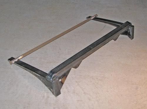 Just finished welding up the rear crossmember for the 52. I had tack-welded it together in the car, then cut it loose from the car to do all the welding on the bench. Next step is to put this deal back in the car and weld it in for keeps.
The beige bar is just a temporary brace to make sure things don't move from all the welding heat.
The smallish tabs on the bottom side of the square tube are the upper mounts for the rear coil-over shocks.
Sunday, October 4, 2009
Building Visuals for a Car Show Event
Last weekend hundreds of custom cars, hot rods, muscle cars, and vintage race cars were on display in downtown Irving, Texas for the second annual Manifolds on Main Car Show. This show was held as a portion of the city’s “Main Street Event” held in the Irving’s Heritage District.
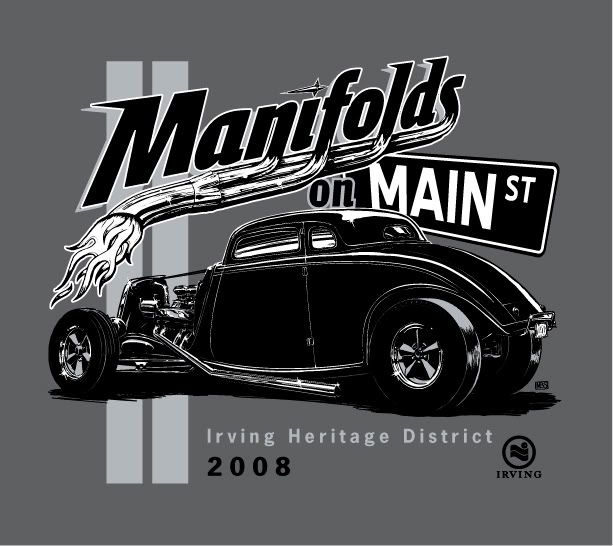
Last year, Bart Stevens (the Main Dude that made both the 2008 and 2009 shows such successes) asked me to design a t-shirt for the first-ever event, which would include a logo design as well as making the art something that could be used on flyers, banners, and more.
First order of business was to develop a logo to go along with the catchy name. Bart and the city needed to get some flyers out and a rudimentary web site in place asap, so after a few sketches...
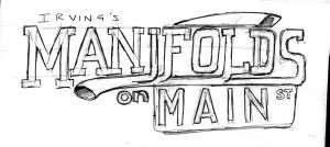
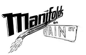
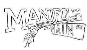
we settled on this version.
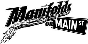
The 2008 t-shirt art was built as a black-and-white and placed onto flyers before I even added the final color.
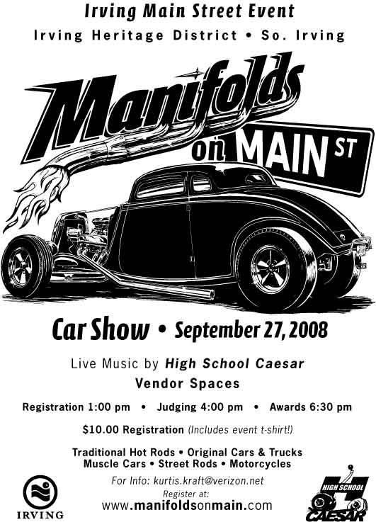
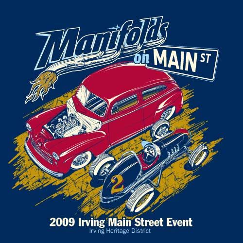
When it came time to plan the 2009 show, we already had the logo and name in-place as a basic brand. Bart specified he wanted to keep the logo going, but have new illustrations of cars for the flyers & shirts. At the 2008 show, Bart had gathered a few vintage race cars as a sort of treat for the participants, but it turned out that this group became one of the headline attractions of the event. We made sure to put a race car on the shirt this year, along with a cool old hot rod.
After I put together a few sketches, Bart and I were really liking the dynamics of a bird’s eye view of the two cars.
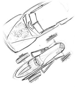
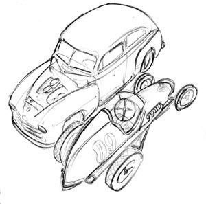
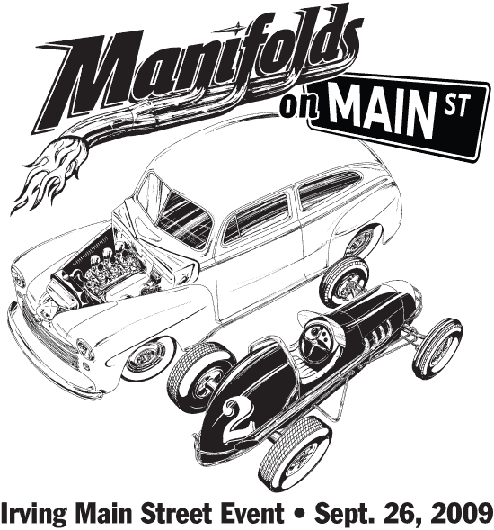
Like last year, black & white came first, then we played around with color, settling on this design on a Navy shirt. (Marcy from Living in Skin also printed some shirts in other color combinations to be sold at the event.)
Along with the car illustrations, Bart approached me with the idea of putting together a set of trading cards showing off a few cars that had attended last year’s event. These would be printed and placed in the goodie bags given to each participant car owner at this year’s show.
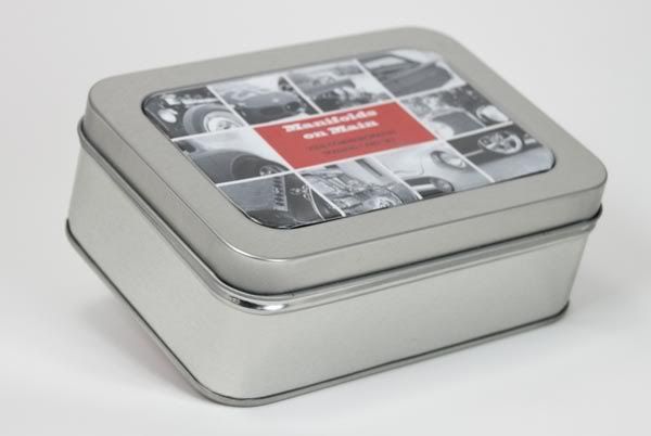
Bart had a pretty solid concept in mind for the layout of the cards, keeping it looking like something vintage. The cards were to be printed on an ivory-toned paper stock in black ink only. The big challenge, though, was to decide what kind of packaging to use. We looked at paper bands to wrap around the cars, ply bags, and several kinds of clear and cardboard boxes. We settled on these tins.
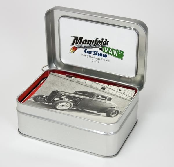
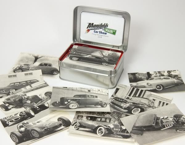
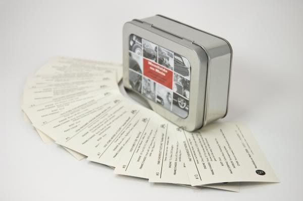
For me, it was an interesting challenge to work with the photography I was given. A couple of the photos came from pro (or talented amateur) photogs, so those were cake. I wanted to make the photos maintain the vintage vibe that we were trying to do with the paper and printing, but that’s not so easy when you’re dealing with a low-resolution photo from a point-and-shoot. Many digital cameras have trouble rendering detail in highlight areas, and it gives photos a “digital” look. Some images required some “doctoring” but I’m pretty pleased with the end results.
Word is that the recipients of the trading cards really liked them, and Bart and I sure hope they can be appreciated by the participants as much as we appreciated their participation in the event.
One other element of the visuals I had the honor of helping with was a coloring book to give to kids that showed up at the event.

(Photo by Bart Stevens)
The show organizers set up a booth to hold a coloring contest for the kids, and the books were a real hit. It’s really humbling to be included with these very talented artists:
Neal DeWitt
Mark Ervin
Flip
Jamie Geesling
A.J. Tony Groves
Robert Hamilton
Todd Jones
Fred Lammers
Chad Lampert
Jeff Norwell
Gabe Pacheco
Ger Peters
Joe Sander
Del Swanson
Last year, Bart Stevens (the Main Dude that made both the 2008 and 2009 shows such successes) asked me to design a t-shirt for the first-ever event, which would include a logo design as well as making the art something that could be used on flyers, banners, and more.
First order of business was to develop a logo to go along with the catchy name. Bart and the city needed to get some flyers out and a rudimentary web site in place asap, so after a few sketches...


we settled on this version.

The 2008 t-shirt art was built as a black-and-white and placed onto flyers before I even added the final color.


When it came time to plan the 2009 show, we already had the logo and name in-place as a basic brand. Bart specified he wanted to keep the logo going, but have new illustrations of cars for the flyers & shirts. At the 2008 show, Bart had gathered a few vintage race cars as a sort of treat for the participants, but it turned out that this group became one of the headline attractions of the event. We made sure to put a race car on the shirt this year, along with a cool old hot rod.
After I put together a few sketches, Bart and I were really liking the dynamics of a bird’s eye view of the two cars.


Like last year, black & white came first, then we played around with color, settling on this design on a Navy shirt. (Marcy from Living in Skin also printed some shirts in other color combinations to be sold at the event.)


Along with the car illustrations, Bart approached me with the idea of putting together a set of trading cards showing off a few cars that had attended last year’s event. These would be printed and placed in the goodie bags given to each participant car owner at this year’s show.
Bart had a pretty solid concept in mind for the layout of the cards, keeping it looking like something vintage. The cards were to be printed on an ivory-toned paper stock in black ink only. The big challenge, though, was to decide what kind of packaging to use. We looked at paper bands to wrap around the cars, ply bags, and several kinds of clear and cardboard boxes. We settled on these tins.


For me, it was an interesting challenge to work with the photography I was given. A couple of the photos came from pro (or talented amateur) photogs, so those were cake. I wanted to make the photos maintain the vintage vibe that we were trying to do with the paper and printing, but that’s not so easy when you’re dealing with a low-resolution photo from a point-and-shoot. Many digital cameras have trouble rendering detail in highlight areas, and it gives photos a “digital” look. Some images required some “doctoring” but I’m pretty pleased with the end results.
Word is that the recipients of the trading cards really liked them, and Bart and I sure hope they can be appreciated by the participants as much as we appreciated their participation in the event.
One other element of the visuals I had the honor of helping with was a coloring book to give to kids that showed up at the event.

(Photo by Bart Stevens)
The show organizers set up a booth to hold a coloring contest for the kids, and the books were a real hit. It’s really humbling to be included with these very talented artists:
Neal DeWitt
Mark Ervin
Flip
Jamie Geesling
A.J. Tony Groves
Robert Hamilton
Todd Jones
Fred Lammers
Chad Lampert
Jeff Norwell
Gabe Pacheco
Ger Peters
Joe Sander
Del Swanson
Tuesday, September 29, 2009
Gene Winfield class
This past weekend I had the privilege of attending the Gene Winfield Custom Metalworking class hosted by Hatfield Restorations in Canton, TX. I gotta say, this was one of the most fun car events I can remember attending!
In case you don't know who Gene is, he is pretty famous in car-customizing circles for being one of the most active car builders the "hobby" has ever known. He had already made a name for himself by the mid-1950's, and continues to work circles around guys a quarter of his age. To put things in perspective, Winfield is to the custom car world as Jack Nicklaus and Arnold Palmer put together are to golf.
There are a number of really talented metalworkers around, but one thing that sets Winfield apart is how well he shares his talent. He goes beyond just demonstrating what he's good at; he tells his students the hows and whys of what he's doing while he's doing it.
As for my experience with the class, I really learned a lot. I probably ought to have taken better notes, but I'm afraid I would have missed something if I would have been jotting something down while he was talking. Winfield would spend some time talking and drawing on a white board expaining some handy homemade tools to make, or where to cut certain cars when you chop the top... sort of like a classroom setting. Then, almost stream-of-conscious-style, he'd go over to the workbench and demonstrate some handy technique. He made it all look so easy!
The rest of the time was spent chopping the top on a '53 Chevy 210 owned by one of the Hatfield Restorations staff. Pete's Chevy really went under a major transformation in the two days... and he's got some really cool stuff planned for the car. Definitely keep your eyes out for this one, guys!

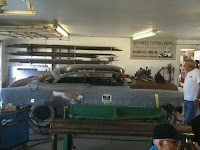
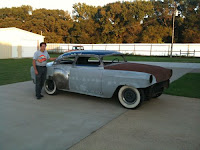
One of the things that several of us "students" were commenting on was how precise Winfield would be on some things, while other aspects of his work were much more carefree. I know there were several panels I probably would have spent more time fitting, but he just got them close with the intention of leading over it all. He makes a good point that some shortcuts are acceptable to get the work out the door more quickly (provided they won't cause any problems down the road), but he makes it clear that there are some things you just don't cut corners on.
A few quick things I learned from the class:
- How to light an acetylene torch off someone else's MIG welding arc.
- You should never hit a hammer with another hammer... unless you think it would be the easiest way to get the results you're after.
- I can actually work lead without it running off the car and onto the floor
- I'm not hitting the weld hard enough when I'm hammerwelding. (And I hit it a lot harder than most people I've seen do it!)
- I need a really high-crown body hammer.
- A chunk of railroad track has loads of uses.
- You don't need expensive tools to do some serious metalshaping.
- Gene Winfield is an 83-year-old teenager.
Lastly, I'd like to thank Gary Hatfield and his staff for hosting the event at their shop and letting us use their tools and resources all weekend.
Sunday, August 30, 2009
Pinstriping Mascot
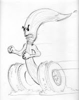
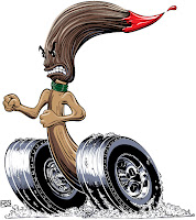
My friend Chandler has been working hard to hone his pinstriping talent, and he's been picking up some side work lately. As things have been growing for him, he asked me to develop some imagery for his work. As we discussed it, we quickly decided that some sort of "mascot" would be appropriate, and that would create a memorable mark to give him some recognition.
This is one of the rare times when both the client and I took off running with the first idea. Since pinstriping is very closely associated with hot rods, a 'striping brush doing a burnout was a natural.
This sketch shown is actually the 2nd sketch I did for the character. The first one was scribbled out on some scrap paper while Chandler was laying some stripes on my son's bicycle helmet. I didn't even take the 1st sketch home, as it was simple enough that I had what I needed in my head. This time, I used relatively traditional media for the sketch: Prismacolor pencil and marker paper.
Once I scanned the sketch, I brought it into Adobe Illustrator as a template layer, and laid out the main shapes with Illustrator's Bézier Pen tool and the basic ellipse tool. From there, I went right into Ai CS4's new "Blob Brush" to render pretty much everything besides the basic silhouette.
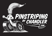
I felt like the flat color of the Blob Brush would lend itself well to the look of using traditional "1-Shot" enamel like many 'stripers use.
Once the Black & White art was together, I tried out a few type treatments for the t-shirt application. Chandler and I settled on House Industries' House Slant font. Added a couple lines of pinstriping, and we had shirt art.
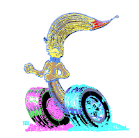
I promised Chandler a color version as well, so I kept on rockin' the Blob Brush, adding layers of color in-between the layers of detail.
Since this illustration is 100% vector art, Chandler now has a logo that can be enlarged or reduced to nearly any size while maintaining whatever detail the output device or process will allow.
Labels:
CS4,
illustration,
Illustrator,
mascot,
vector
Wednesday, July 15, 2009
New Brookville T-Shirt art
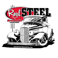
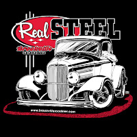
Just finished up a new design for t-shirts for Brookville Roadster. The art was sketched digitally in Photoshop, then cleaned up by hand-building vector paths in Illustrator CS4. A lot of the detail work was done using AI CS4's new "Blob Brush" tool. The basic design will be printed on both black- and white shirts.
Labels:
art,
creative,
design,
illustration,
t-shirt
Tuesday, July 7, 2009
The Curse of the Cubicle
Two or three decades ago, different workers in different parts of any organization used different kinds of tools and devices to do their respective tasks. Accounting departments would use ledger books and adding machines. Customer Service and Sales primarily used telephones, ink pens, and perhaps typewriters. Art departments used X-Acto knives, tech pens, rubylith, waxers, and light boxes. And not only the tools were different. Each of these types of workers used different kinds of desks, filing systems, and even the lighting and flooring was typically different from one department to another. Each "department" was set up to be as feasibly optimal to get things done in an efficient manner.
Then came the computers.
Once we started getting all these beige boxes installed in our work areas, our work areas became increasingly installed on the beige boxes. As more and more tools have gone digital, we have lost sight of the fact that the tools themselves are still quite different from one another. You'd never expect your accounting staff to use Photoshop to crunch P&L statements, and you wouldn't ask the art department to edit images in Excel.
Funny to contrast with these thoughts with the attitudes of so many organizations to homogenize nearly everything in the workplace. I mean, these are all just computers, right? It's like the attitude is, "the numbers people are just better than others at doing numbers on the computer." Or, "The art people just know how to use their computers to make art." Now that our tangible tools have become software, we forget that different workers need totally different setups. And that we really are still using different tools to get different things done.
Nowadays, if you were to walk into nearly any American organization, you'd have a tough time telling the accounting department from customer service from the art department. They all have the same fluorescent lighting. They all have the same gray cubicles. They all have the same black-and-silver electric boxes on their desks. I often wonder if such environments do more to stifle creativity and productivity than we realize.
Sunday, June 28, 2009
Wacom tablets 101 for newbies
I often tell people that my Mac is one of the coolest things attached to my Wacom tablet. Yes, I consider the Wacom tablet more important than the computer itself. If I could choose one item that I would consider "mission-critical", this would be it.
I've been using Wacom tablets since early 1995 (back when we used them to do cave paintings), so I get quite a few people asking for advice on them. That said, it just made sense to compile this list to help others make the decision on whether or not to buy a tablet, or to make better use of one you've already bought.
Placement in workspace
When you first start using your tablet, you should try placing the tablet in a couple different positions to go along with whatever feels most comfortable. It seems about half the people that use tablets place them next to the keyboard: to the right- or left, depending on which hand is used for drawing. Others like to place the tablet between themselves and the keyboard. Still others prefer to hold the tablet in their laps.
I'm a "to the right of the keyboard" person, but I have the keyboard shifted to the left so that the right edge of the keyboard is adjacent with the center of my monitor. This centers my 9x12 Wacom tablet right in front of my right shoulder - a very natural position for me. I make frequent use of keyboard modifiers while I'm working, and it's easy to hover my left hand over the keyboard for this while my right hand is over the tablet.
The point here is that you want to try to get your workspace as comfortable as possible.
Connections (powered port)
You'll want a powered port for the USB connection on your tablet. In most cases, this means plugging it straight into your computer, or into a hub that has it's own electrical power cord. The extra ports on Mac keyboards and some external USB hubs do not have enough power to make the Wacom tablet work. These ports are designed for data only, but the Wacom tablets need both power and data to pass over the USB connection.
So just make sure you have a correct port available for the tablet.
Mapping & Movement
One of the things that really throws a lot of Wacom newbies off is the correlation of the tablet to the screen. If you're used to a traditional mouse (or the trackpad on a notebook computer), you're probably frequently picking up the mouse, shifting it over, placing it down again and moving the cursor further on the screen. This behavior is fine* when you are just moving a cursor around, but not when you're drawing or retouching photos.
Basically, the entire surface of the tablet gets mapped to the entire screen. So if you place the pen near the upper-left corner of the tablet, your cursor will jump to that same relative location on the screen. Then if you were to pick up your pen, then bring it down at the exact center of the tablet, the cursor will instantly jump to the exact center of the screen.
You can adjust the mapping to fit multiple monitors, etc., but the same general rules will apply to the area you assign to the tablet vs. screen(s).
One of the other things is that you need to be aware of the fact that touching the pen to the tablet - with even very slight pressure - will be registered as a click, just as if you are holding down the mouse button. If you want to move your cursor on-screen in the same manner as moving your mouse without clicking, you just need to hover the pen over the tablet. Keep the pen tip about 1/4" away from the tablet surface as you move, much the same way that you would move a pen or pencil across a piece of paper to get to another part of the paper.
*I could argue against the ergonomics on this, but not now.
Pressure: the Tablet's reason for existence
Perhaps the biggest reason most artists (photographers included) would have for getting a Wacom tablet would be the pressure sensitive aspect. Instead of just making a steady mark, you can vary the darkness or width of your stroke as you are making that stroke. Think of using a regular old #2 pencil. If you press it on the paper very lightly, you'll get a thin, light-colored stroke. As you press harder on the paper, the stroke becomes darker and thicker. This same behavior can be duplicated with the tablet, but you can also turn on/off thickness or darkness (opacity) independently in most creative software.
Button Assignments
Assignment of the buttons on the barrel of the pen (and elsewhere on the tablet bezel for some models) is really up to you. The switch on the side of the pen is a rocker switch that can be assigned different tasks or modifiers for pressing the forward side or the rearward side of the switch. Personally, I frequently find myself accidentally hitting the forward position, so I just keep it set to "Ignored". I have the rearward position set to be a double-click, as a regular double click using the pen tip can be tricky at times.
I should also note that each button can be assigned different functions depending on which application you are running (at least on the Intuos models). For example: If you have the rear button set to be the spacebar for quick panning in Photoshop, you might want it to be the command key in Illustrator to be able to quickly edit curves while you're using the Bezier pen tool. The Wacom tablet will know when you've switched from Photoshop to Illustrator, so it makes the adjustments on-the-fly.
One more note about the switch on the side of the pen: I usually keep it oriented so that I work the switch with my thumb, but I know of several people that use their first finger on the switch instead. Again, this is a personal preference thing, so go with whichever way feels right to you.
Trash the Mouse
Many of the people I know that use the Intuos line end up sticking their traditional mouse in a drawer or even the trash can. I keep a mouse attached to the home computer for the wife & kids, but I honestly don't know whatever happened to the mouse that came with the computer I use at the office.
The only trouble I have with using the pen instead of a mouse for regular computer usage (web surfing, spreadsheets, email, etc.) is that some versions of Apple's Safari web browser occasionally takes two or three "taps" from the pen to register as a "click". My solution is simply to use another browser like Firefox, which I like better anyways.
Downloading Brushes
If you've been around Photoshop much, you've undoubtedly discovered the myriad brushes that you can download and add into your Photoshop settings. Just be aware that most of these are designed as single-click placement like "clip art", and really aren't going to be much more effective with a Wacom tablet. Some, however, can be modified to make some neat effects... but the fact is, you'll have to do some tweaking on them to see them really shine with a Wacom tablet.
Size of tablet
Ah, one of the most popular questions you hear people ask across the internet: "What size tablet should I get?". This really depends on the way you work, and what your screen setup is. Honestly, I have little use for the smallest 4x5 or 4x6 size tablets.
If all you ever do is some occasional subtle dodging and burning in some photos, then the smallest tablets might be all you need.
For most people, the "medium" tablets are perfect. Currently, this means an 8.8 x 5.5 active area on the Intuos 4. Previously, Wacom offered a 6x8, and I know several pros who continue to use this one. This size is big enough to allow you to do some more detailed work like building complex masks in Photoshop, yet it's still small enough to travel fairly well. It also doesn't take up much more desk space than a typical mousepad.
The 9x12 or larger tablets seem to work best for people who use a tablet exclusively, and spend most of their time in Photoshop or Painter or similar drawing/painting apps. These take up a LOT of desk space, but if you want the tablet to span across a very large screen (or multiple smaller screens), this is the only way to go. This is also my personal preference, mainly due to the fact that I "rough in" a lot of my drawings by drawing from the shoulder.
Well, I hope this has been informative for you, and if you have any questions feel free to ask in the comments below.
Subscribe to:
Posts (Atom)


