
"Commercial Art". Some would say that's an antiquated term. Even when I was in college in the early 1990's (when computer classes were still optional for design students), they were already poo-pooing that term. They called our department "Communication Arts" -- a term that sounded kinda redundant to me. (All art is communication IMO.)
With the advent of the computer being used for most design and layout, we've been hearing "Graphic Artist" or "Graphic Designer" frequently used for those who work with images and color on a computer screen. I've been telling people for nearly two decades that I am a Graphic Artist. But... lately I've found myself not liking that term anymore.
In my career, I've seen that term get watered down to refer to anyone who has an Adobe app launched on their screen for at least a couple hours a week. There is really nothing about what some "Graphic Artists" do that could be considered art. At best, they may drop some "art" into a template or check it to make sure it will print properly or show up correctly on a web site. But that's just technical skill. It's not creative, and they're not making art. I've even noticed that some of the most effective people at these kinds of positions are not creative people at all.
Now, don't get me wrong, I'm not trying to belittle those who have "Graphic Artist" under their name on their business cards and do the tasks I just mentioned. Honestly, I'm not very good at repetitive efficiency. I find myself being distracted by my own creativity when I'm required to repetitive tasks, so my efficiency plummets.
So back to the old school... I remember wanting to be a "Commercial Artist" when I grew up. That term has never bothered me like it does many of my colleagues. And I have always associated that term with people that can draw and make it reproducible. Right there, that's a lot of how I see the way I work. Technology has changed a lot of the methods and techniques, but the thought patterns remain with the creativity of solving visual problems, and making sure the solutions can be carried out to their full intent.
So if you ask me what I do, I'll say, "Commercial Artist".
Thursday, October 8, 2009
Tuesday, October 6, 2009
Fleetline Progress: Rear Crossmember
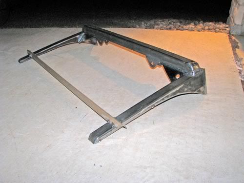
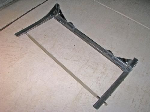
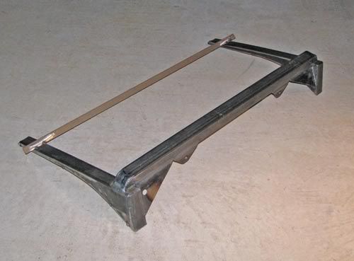 Just finished welding up the rear crossmember for the 52. I had tack-welded it together in the car, then cut it loose from the car to do all the welding on the bench. Next step is to put this deal back in the car and weld it in for keeps.
The beige bar is just a temporary brace to make sure things don't move from all the welding heat.
The smallish tabs on the bottom side of the square tube are the upper mounts for the rear coil-over shocks.

Sunday, October 4, 2009
Building Visuals for a Car Show Event
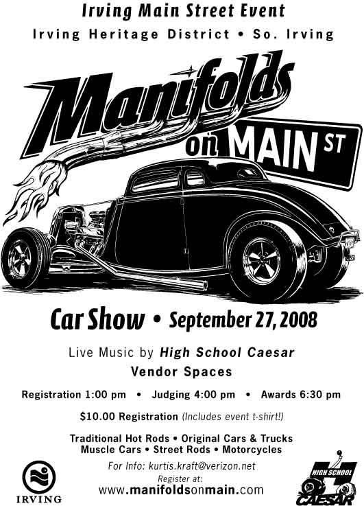
Last weekend hundreds of custom cars, hot rods, muscle cars, and vintage race cars were on display in downtown Irving, Texas for the second annual Manifolds on Main Car Show. This show was held as a portion of the city’s “Main Street Event” held in the Irving’s Heritage District.
Last year, Bart Stevens (the Main Dude that made both the 2008 and 2009 shows such successes) asked me to design a t-shirt for the first-ever event, which would include a logo design as well as making the art something that could be used on flyers, banners, and more.
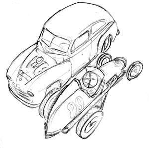
First order of business was to develop a logo to go along with the catchy name. Bart and the city needed to get some flyers out and a rudimentary web site in place asap, so after a few sketches...
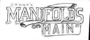
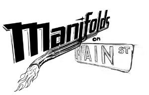
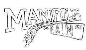
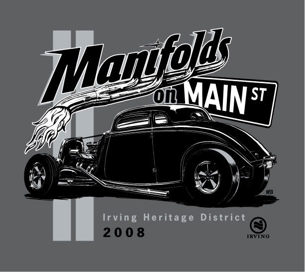
we settled on this version.
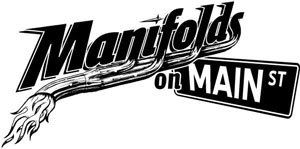
The 2008 t-shirt art was built as a black-and-white and placed onto flyers before I even added the final color.
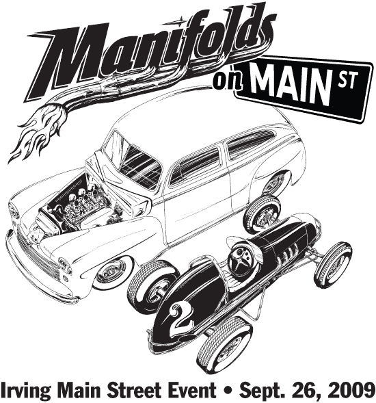
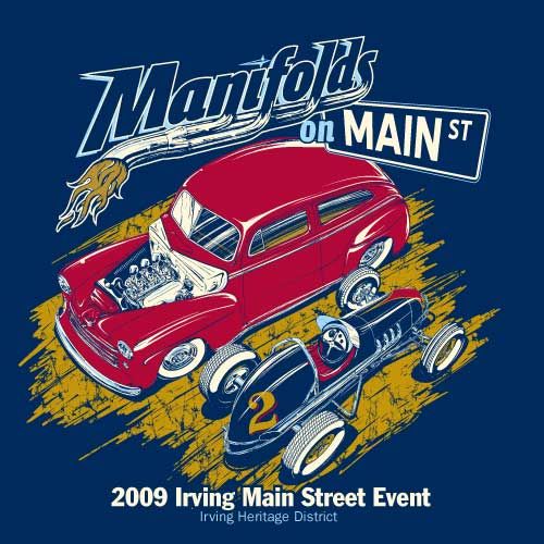
When it came time to plan the 2009 show, we already had the logo and name in-place as a basic brand. Bart specified he wanted to keep the logo going, but have new illustrations of cars for the flyers & shirts. At the 2008 show, Bart had gathered a few vintage race cars as a sort of treat for the participants, but it turned out that this group became one of the headline attractions of the event. We made sure to put a race car on the shirt this year, along with a cool old hot rod.
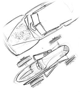
After I put together a few sketches, Bart and I were really liking the dynamics of a bird’s eye view of the two cars.
Like last year, black & white came first, then we played around with color, settling on this design on a Navy shirt. (Marcy from Living in Skin also printed some shirts in other color combinations to be sold at the event.)
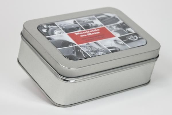
Along with the car illustrations, Bart approached me with the idea of putting together a set of trading cards showing off a few cars that had attended last year’s event. These would be printed and placed in the goodie bags given to each participant car owner at this year’s show.
Bart had a pretty solid concept in mind for the layout of the cards, keeping it looking like something vintage. The cards were to be printed on an ivory-toned paper stock in black ink only. The big challenge, though, was to decide what kind of packaging to use. We looked at paper bands to wrap around the cars, ply bags, and several kinds of clear and cardboard boxes. We settled on these tins.
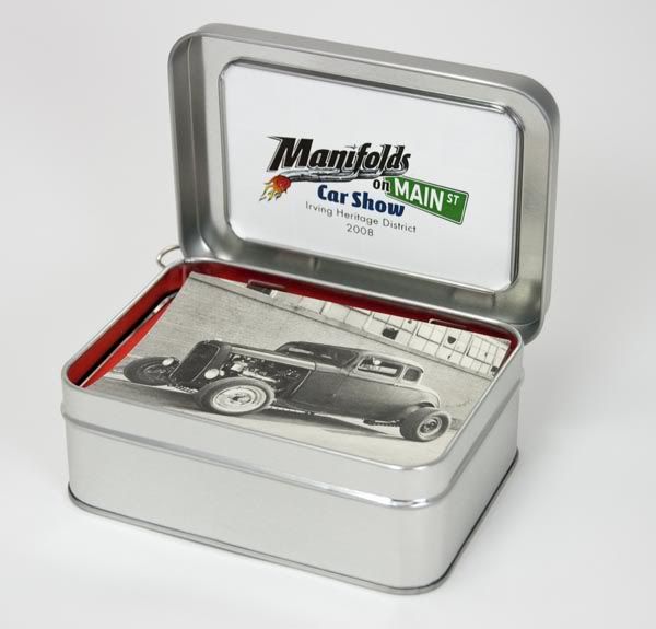
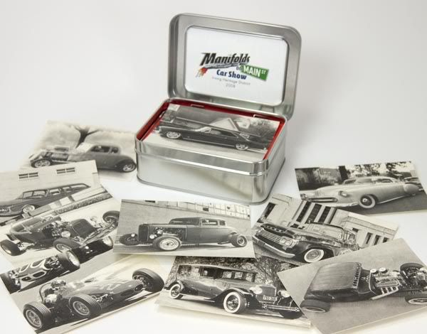
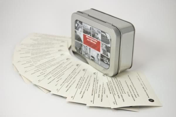
For me, it was an interesting challenge to work with the photography I was given. A couple of the photos came from pro (or talented amateur) photogs, so those were cake. I wanted to make the photos maintain the vintage vibe that we were trying to do with the paper and printing, but that’s not so easy when you’re dealing with a low-resolution photo from a point-and-shoot. Many digital cameras have trouble rendering detail in highlight areas, and it gives photos a “digital” look. Some images required some “doctoring” but I’m pretty pleased with the end results.
Word is that the recipients of the trading cards really liked them, and Bart and I sure hope they can be appreciated by the participants as much as we appreciated their participation in the event.
One other element of the visuals I had the honor of helping with was a coloring book to give to kids that showed up at the event.

(Photo by Bart Stevens)
The show organizers set up a booth to hold a coloring contest for the kids, and the books were a real hit. It’s really humbling to be included with these very talented artists:
Neal DeWitt
Mark Ervin
Flip
Jamie Geesling
A.J. Tony Groves
Robert Hamilton
Todd Jones
Fred Lammers
Chad Lampert
Jeff Norwell
Gabe Pacheco
Ger Peters
Joe Sander
Del Swanson
Last year, Bart Stevens (the Main Dude that made both the 2008 and 2009 shows such successes) asked me to design a t-shirt for the first-ever event, which would include a logo design as well as making the art something that could be used on flyers, banners, and more.
First order of business was to develop a logo to go along with the catchy name. Bart and the city needed to get some flyers out and a rudimentary web site in place asap, so after a few sketches...


we settled on this version.

The 2008 t-shirt art was built as a black-and-white and placed onto flyers before I even added the final color.


When it came time to plan the 2009 show, we already had the logo and name in-place as a basic brand. Bart specified he wanted to keep the logo going, but have new illustrations of cars for the flyers & shirts. At the 2008 show, Bart had gathered a few vintage race cars as a sort of treat for the participants, but it turned out that this group became one of the headline attractions of the event. We made sure to put a race car on the shirt this year, along with a cool old hot rod.
After I put together a few sketches, Bart and I were really liking the dynamics of a bird’s eye view of the two cars.


Like last year, black & white came first, then we played around with color, settling on this design on a Navy shirt. (Marcy from Living in Skin also printed some shirts in other color combinations to be sold at the event.)


Along with the car illustrations, Bart approached me with the idea of putting together a set of trading cards showing off a few cars that had attended last year’s event. These would be printed and placed in the goodie bags given to each participant car owner at this year’s show.
Bart had a pretty solid concept in mind for the layout of the cards, keeping it looking like something vintage. The cards were to be printed on an ivory-toned paper stock in black ink only. The big challenge, though, was to decide what kind of packaging to use. We looked at paper bands to wrap around the cars, ply bags, and several kinds of clear and cardboard boxes. We settled on these tins.


For me, it was an interesting challenge to work with the photography I was given. A couple of the photos came from pro (or talented amateur) photogs, so those were cake. I wanted to make the photos maintain the vintage vibe that we were trying to do with the paper and printing, but that’s not so easy when you’re dealing with a low-resolution photo from a point-and-shoot. Many digital cameras have trouble rendering detail in highlight areas, and it gives photos a “digital” look. Some images required some “doctoring” but I’m pretty pleased with the end results.
Word is that the recipients of the trading cards really liked them, and Bart and I sure hope they can be appreciated by the participants as much as we appreciated their participation in the event.
One other element of the visuals I had the honor of helping with was a coloring book to give to kids that showed up at the event.

(Photo by Bart Stevens)
The show organizers set up a booth to hold a coloring contest for the kids, and the books were a real hit. It’s really humbling to be included with these very talented artists:
Neal DeWitt
Mark Ervin
Flip
Jamie Geesling
A.J. Tony Groves
Robert Hamilton
Todd Jones
Fred Lammers
Chad Lampert
Jeff Norwell
Gabe Pacheco
Ger Peters
Joe Sander
Del Swanson
Subscribe to:
Posts (Atom)


