Tuesday, October 6, 2009

Fleetline Progress: Rear Crossmember

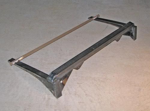
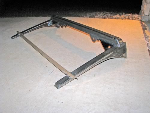
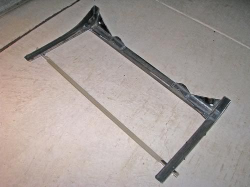
Just finished welding up the rear crossmember for the 52. I had tack-welded it together in the car, then cut it loose from the car to do all the welding on the bench. Next step is to put this deal back in the car and weld it in for keeps.

The beige bar is just a temporary brace to make sure things don't move from all the welding heat.

The smallish tabs on the bottom side of the square tube are the upper mounts for the rear coil-over shocks.


Tig Welding


Still not really great, but at least I'm getting better. That's what counts, right?

Sunday, October 4, 2009

Building Visuals for a Car Show Event

Last weekend hundreds of custom cars, hot rods, muscle cars, and vintage race cars were on display in downtown Irving, Texas for the second annual Manifolds on Main Car Show. This show was held as a portion of the city’s “Main Street Event” held in the Irving’s Heritage District.

Last year, Bart Stevens (the Main Dude that made both the 2008 and 2009 shows such successes) asked me to design a t-shirt for the first-ever event, which would include a logo design as well as making the art something that could be used on flyers, banners, and more.

First order of business was to develop a logo to go along with the catchy name. Bart and the city needed to get some flyers out and a rudimentary web site in place asap, so after a few sketches...

Photobucket


Photobucket


Photobucket


we settled on this version.

Photobucket


The 2008 t-shirt art was built as a black-and-white and placed onto flyers before I even added the final color.
Photobucket

Photobucket


When it came time to plan the 2009 show, we already had the logo and name in-place as a basic brand. Bart specified he wanted to keep the logo going, but have new illustrations of cars for the flyers & shirts. At the 2008 show, Bart had gathered a few vintage race cars as a sort of treat for the participants, but it turned out that this group became one of the headline attractions of the event. We made sure to put a race car on the shirt this year, along with a cool old hot rod.

After I put together a few sketches, Bart and I were really liking the dynamics of a bird’s eye view of the two cars.

Photobucket

Photobucket

Like last year, black & white came first, then we played around with color, settling on this design on a Navy shirt. (Marcy from Living in Skin also printed some shirts in other color combinations to be sold at the event.)


Photobucket

Photobucket


Along with the car illustrations, Bart approached me with the idea of putting together a set of trading cards showing off a few cars that had attended last year’s event. These would be printed and placed in the goodie bags given to each participant car owner at this year’s show.

Bart had a pretty solid concept in mind for the layout of the cards, keeping it looking like something vintage. The cards were to be printed on an ivory-toned paper stock in black ink only. The big challenge, though, was to decide what kind of packaging to use. We looked at paper bands to wrap around the cars, ply bags, and several kinds of clear and cardboard boxes. We settled on these tins.


Photobucket


Photobucket


Photobucket


Photobucket


For me, it was an interesting challenge to work with the photography I was given. A couple of the photos came from pro (or talented amateur) photogs, so those were cake. I wanted to make the photos maintain the vintage vibe that we were trying to do with the paper and printing, but that’s not so easy when you’re dealing with a low-resolution photo from a point-and-shoot. Many digital cameras have trouble rendering detail in highlight areas, and it gives photos a “digital” look. Some images required some “doctoring” but I’m pretty pleased with the end results.

Word is that the recipients of the trading cards really liked them, and Bart and I sure hope they can be appreciated by the participants as much as we appreciated their participation in the event.

One other element of the visuals I had the honor of helping with was a coloring book to give to kids that showed up at the event.


Photobucket

(Photo by Bart Stevens)

The show organizers set up a booth to hold a coloring contest for the kids, and the books were a real hit. It’s really humbling to be included with these very talented artists:

Neal DeWitt
Mark Ervin
Flip
Jamie Geesling
A.J. Tony Groves
Robert Hamilton
Todd Jones
Fred Lammers
Chad Lampert
Jeff Norwell
Gabe Pacheco
Ger Peters
Joe Sander
Del Swanson

Tuesday, September 29, 2009

Gene Winfield class


This past weekend I had the privilege of attending the Gene Winfield Custom Metalworking class hosted by Hatfield Restorations in Canton, TX. I gotta say, this was one of the most fun car events I can remember attending!

In case you don't know who Gene is, he is pretty famous in car-customizing circles for being one of the most active car builders the "hobby" has ever known. He had already made a name for himself by the mid-1950's, and continues to work circles around guys a quarter of his age. To put things in perspective, Winfield is to the custom car world as Jack Nicklaus and Arnold Palmer put together are to golf.

There are a number of really talented metalworkers around, but one thing that sets Winfield apart is how well he shares his talent. He goes beyond just demonstrating what he's good at; he tells his students the hows and whys of what he's doing while he's doing it.

As for my experience with the class, I really learned a lot. I probably ought to have taken better notes, but I'm afraid I would have missed something if I would have been jotting something down while he was talking. Winfield would spend some time talking and drawing on a white board expaining some handy homemade tools to make, or where to cut certain cars when you chop the top... sort of like a classroom setting. Then, almost stream-of-conscious-style, he'd go over to the workbench and demonstrate some handy technique. He made it all look so easy!

The rest of the time was spent chopping the top on a '53 Chevy 210 owned by one of the Hatfield Restorations staff. Pete's Chevy really went under a major transformation in the two days... and he's got some really cool stuff planned for the car. Definitely keep your eyes out for this one, guys!

One of the things that several of us "students" were commenting on was how precise Winfield would be on some things, while other aspects of his work were much more carefree. I know there were several panels I probably would have spent more time fitting, but he just got them close with the intention of leading over it all. He makes a good point that some shortcuts are acceptable to get the work out the door more quickly (provided they won't cause any problems down the road), but he makes it clear that there are some things you just don't cut corners on.

A few quick things I learned from the class:
  • How to light an acetylene torch off someone else's MIG welding arc.
  • You should never hit a hammer with another hammer... unless you think it would be the easiest way to get the results you're after.
  • I can actually work lead without it running off the car and onto the floor
  • I'm not hitting the weld hard enough when I'm hammerwelding. (And I hit it a lot harder than most people I've seen do it!)
  • I need a really high-crown body hammer.
  • A chunk of railroad track has loads of uses.
  • You don't need expensive tools to do some serious metalshaping.
  • Gene Winfield is an 83-year-old teenager.
If you ever get the opportunity, I highly recommend this class... but if you're gonna get the most out of it, you'll need to be aggressive. If you can't see what Winfield is doing, get where you can... stand on a chair, walk around to the other side of the workbench, whatever. He won't invite you up there, but if you come in close, he will welcome you.

Lastly, I'd like to thank Gary Hatfield and his staff for hosting the event at their shop and letting us use their tools and resources all weekend.

Sunday, August 30, 2009

Pinstriping Mascot


My friend Chandler has been working hard to hone his pinstriping talent, and he's been picking up some side work lately. As things have been growing for him, he asked me to develop some imagery for his work. As we discussed it, we quickly decided that some sort of "mascot" would be appropriate, and that would create a memorable mark to give him some recognition.


This is one of the rare times when both the client and I took off running with the first idea. Since pinstriping is very closely associated with hot rods, a 'striping brush doing a burnout was a natural.

This sketch shown is actually the 2nd sketch I did for the character. The first one was scribbled out on some scrap paper while Chandler was laying some stripes on my son's bicycle helmet. I didn't even take the 1st sketch home, as it was simple enough that I had what I needed in my head. This time, I used relatively traditional media for the sketch: Prismacolor pencil and marker paper.

Once I scanned the sketch, I brought it into Adobe Illustrator as a template layer, and laid out the main shapes with Illustrator's Bézier Pen tool and the basic ellipse tool. From there, I went right into Ai CS4's new "Blob Brush" to render pretty much everything besides the basic silhouette.

I felt like the flat color of the Blob Brush would lend itself well to the look of using traditional "1-Shot" enamel like many 'stripers use.

Once the Black & White art was together, I tried out a few type treatments for the t-shirt application. Chandler and I settled on House Industries' House Slant font. Added a couple lines of pinstriping, and we had shirt art.

I promised Chandler a color version as well, so I kept on rockin' the Blob Brush, adding layers of color in-between the layers of detail.

Since this illustration is 100% vector art, Chandler now has a logo that can be enlarged or reduced to nearly any size while maintaining whatever detail the output device or process will allow.

Wednesday, July 15, 2009

New Brookville T-Shirt art


Just finished up a new design for t-shirts for Brookville Roadster. The art was sketched digitally in Photoshop, then cleaned up by hand-building vector paths in Illustrator CS4. A lot of the detail work was done using AI CS4's new "Blob Brush" tool. The basic design will be printed on both black- and white shirts.

Tuesday, July 7, 2009

The Curse of the Cubicle

Two or three decades ago, different workers in different parts of any organization used different kinds of tools and devices to do their respective tasks. Accounting departments would use ledger books and adding machines. Customer Service and Sales primarily used telephones, ink pens, and perhaps typewriters. Art departments used X-Acto knives, tech pens, rubylith, waxers, and light boxes. And not only the tools were different. Each of these types of workers used different kinds of desks, filing systems, and even the lighting and flooring was typically different from one department to another. Each "department" was set up to be as feasibly optimal to get things done in an efficient manner.

Then came the computers.

Once we started getting all these beige boxes installed in our work areas, our work areas became increasingly installed on the beige boxes. As more and more tools have gone digital, we have lost sight of the fact that the tools themselves are still quite different from one another. You'd never expect your accounting staff to use Photoshop to crunch P&L statements, and you wouldn't ask the art department to edit images in Excel.

Funny to contrast with these thoughts with the attitudes of so many organizations to homogenize nearly everything in the workplace. I mean, these are all just computers, right? It's like the attitude is, "the numbers people are just better than others at doing numbers on the computer." Or, "The art people just know how to use their computers to make art." Now that our tangible tools have become software, we forget that different workers need totally different setups. And that we really are still using different tools to get different things done.

Nowadays, if you were to walk into nearly any American organization, you'd have a tough time telling the accounting department from customer service from the art department. They all have the same fluorescent lighting. They all have the same gray cubicles. They all have the same black-and-silver electric boxes on their desks. I often wonder if such environments do more to stifle creativity and productivity than we realize.